Kamis, 17 April 2014

Swipebody Mobile Retina | HTML5 & CSS3 And iWebApp (Mobile)


General Features

  • Custom jQuery code.

  • Page preloader with fader!

  • Optimized for all types of mobile screens!

  • WebApp Ready!

  • AJAX/PHP Contact Form with validation!

  • Touch Swipe image slider!

  • Colorbox image gallery!

  • Photoswipe touch image gallery!

  • Full retina support for all graphic elements!

  • 800 icons availalble!

  • 40 icon lists availalble!

  • Google fonts integration!


Typograpghy features!

  • 1 text column!

  • 2 text columns!

  • 3 text columns!

  • 1 column with icon

  • 2 columns with icon

  • 3 columns with icon

  • 1 column with image

  • 2 columns with image

  • 3 columns with image!

  • Blockquote with icons!

  • Blockquote without icons!

  • CSS3 Highlighted text paragraphs

  • CSS3 Dropcaps text style!

  • CSS3 Table!

  • CSS3 Web 2.0 buttons

  • CSS3 Minimal buttons

  • List with icons!

  • Classic lists with numbers or bullet!

  • Thumbnail adaptive blog post!

  • Fullwidth blog post!

  • Ads widget in blog!

  • Recent widget in blog

  • Comments widget

  • Replies widget!


jQuery features!

  • jQuery Swipe Slider

  • jQuery Photoswipe thumbnail gallery!

  • jQuery Colorbox 1 column gallery!

  • jQuery Colorbox 2 column gallery!

  • jQuery Colorbox filtrable gallery!

  • jQuery Checkboxes ( retina ready )

  • jQuery Radioboxes ( retina ready )

  • jQuery On/Off Toggle! ( retina ready )

  • jQuery +/- Toggle ( retina ready )

  • jQuery Tabs

  • jQuery Classic Notifications ( retina ready )

  • jQuery Big Notifications! ( retina ready )

  • jQuery Header notifications!


Epsilon mobile framework! What is it


Epsilon is the most advanced and easiet to use mobile framework we’ve ever built! It’s made in such fashion that you’ll have all possible elements styled up for this specific template and all you’ll have to do is call them to your page!

Is Epsilon harder to use than coding old fashion way?


NO! It’s actually far far easier! All elements are dynamic, you can use as many as you want, they are just copy paste, replace with your information, done! That’s all!

How is Epsilon/Resepina is built?


Epsilon is the backbone of Resepina , it has 2 stylesheets and Resepina has the style.css and graphic elements!

  • style.css, has all the design elements of the template!

  • framework-style.css, includes all typography sizes and colors, element styles, and design features for the elements in Epsilon, styled for Resepina

  • framework.css, includes the sizes, alignment, spacing, visual hierachy of the elements! This is basically the engine of Epsilon!


Thank you dkoated.com for the coach arrows!

Attention! Certain devices may not support body dragging, for example, the Nokia Lumia can freeze up! We’ve implemented functionality for both the button and the body to deploy the navigation! We’re not responsible if your device doesn’t support CSS3 transform transitions!


Requires iOS 5.0 or higher, Android 4.3 or higher, Latest RIM, Windows Mobile 8!

Slideby | Mobile & Tablet Responsive Template (Mobile)


Typography Features


  • 1, 2, 3 text columns

  • 1, 2, 3 image columns

  • 1, 2, 3 icon columns

  • CSS3 8 text highlight variations

  • CSS3 Code structures

  • CSS3 Table

  • CSS3 Speach bubbles

  • CSS3 Fields

  • CSS3 8 Color variation small buttons

  • CSS3 8 Color variation big buttons

  • CSS3 8 Buttons with 400 retina ready icons

  • CSS3 Hoirzontal square and rounded charts

  • 4 different testimonial variations

  • 48 icon lists


jQuery Features


  • Custom jQuery Code!

  • CSS3, AJAX, PHP contact form with validation

  • jQuery Page Preloader

  • jQuery Device detection

  • jQuery Tap sliding door

  • jQuery Submenus

  • jQuery 4 Toggle Variations

  • jQuery Tabs

  • jQuery Big Notifications

  • jQuery Small Notifications

  • jQuery Checkboxes

  • jQuery Radioboxes

  • jQuery Image Slider

  • jQuery Qute Slider

  • jQuery Text Slider

  • jQuery Thumbnail Slider

  • jQuery Colorbox Portofolio

  • jQuery Swipebox Touch Swipe Gallery


Design Features


  • Ergonomic navigation

  • High Definition Graphics for high definition displays

  • Looks gorgeous on iOS, Nokia, Samsung, HTC, and any device with a high DPI screen and low DPI screen!

  • 48 High definition list icons

  • 400 Icons included for general usage and for the PSD

  • 2 PSD Files included to create new nav items

  • PNG graphics hihgly optimized for extremly fast load times

  • iOS Homepage Icon

  • iOS Splash Screen


Requires iOS 6 or higher, Android 4.2.2 or higher, Windows Mobile 8, latest RIM OS.

Selasa, 15 April 2014

Chivalry Mobile Retina | HTML5 & CSS3 And iWebApp (Mobile)


Works with all OS’s young or old! Maximum compatibility!

General Features

  • Custom jQuery code.

  • Page preloader with fader!

  • Optimized for all types of mobile screens!

  • WebApp Ready!

  • AJAX/PHP Contact Form with validation!

  • Touch Swipe image slider!

  • Colorbox image gallery!

  • Photoswipe touch image gallery!

  • Full retina support for all graphic elements!

  • 800 icons availalble!

  • 40 icon lists availalble!

  • Google fonts integration!


Typograpghy features!

  • 1 text column!

  • 2 text columns!

  • 3 text columns!

  • 1 column with icon

  • 2 columns with icon

  • 3 columns with icon

  • 1 column with image

  • 2 columns with image

  • 3 columns with image!

  • Blockquote with icons!

  • Blockquote without icons!

  • CSS3 Highlighted text paragraphs

  • CSS3 Dropcaps text style!

  • CSS3 Table!

  • CSS3 Web 2.0 buttons

  • CSS3 Minimal buttons

  • List with icons!

  • Classic lists with numbers or bullet!

  • Thumbnail adaptive blog post!

  • Fullwidth blog post!

  • Ads widget in blog!

  • Recent widget in blog

  • Comments widget

  • Replies widget!


jQuery features!

  • jQuery Swipe Slider

  • jQuery Photoswipe thumbnail gallery!

  • jQuery Colorbox 1 column gallery!

  • jQuery Colorbox 2 column gallery!

  • jQuery Colorbox filtrable gallery!

  • jQuery Checkboxes ( retina ready )

  • jQuery Radioboxes ( retina ready )

  • jQuery On/Off Toggle! ( retina ready )

  • jQuery +/- Toggle ( retina ready )

  • jQuery Tabs

  • jQuery Classic Notifications ( retina ready )

  • jQuery Big Notifications! ( retina ready )

  • jQuery Header notifications!


Epsilon mobile framework! What is it


Epsilon is the most advanced and easiet to use mobile framework we’ve ever built! It’s made in such fashion that you’ll have all possible elements styled up for this specific template and all you’ll have to do is call them to your page!

Is Epsilon harder to use than coding old fashion way?


NO! It’s actually far far easier! All elements are dynamic, you can use as many as you want, they are just copy paste, replace with your information, done! That’s all!

How is Epsilon/Resepina is built?


Epsilon is the backbone of Resepina , it has 2 stylesheets and Resepina has the style.css and graphic elements!

  • style.css, has all the design elements of the template!

  • framework-style.css, includes all typography sizes and colors, element styles, and design features for the elements in Epsilon, styled for Resepina

  • framework.css, includes the sizes, alignment, spacing, visual hierachy of the elements! This is basically the engine of Epsilon!


FlatSum - Minimal HTML5 Portfolio Template (Creative)


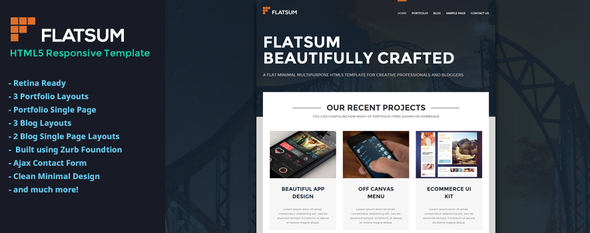
FlatSum is a minimalistic HTML5 portfolio template for creative individuals and bloggers. It uses flat design styles and bold typography. Fully Responsive and Retina Ready, ensuring every element of this template will look good on mobile and tablet devices. Built using Zurb Foundation Framework 5, easy to customize and update.
The template comes with 3 grid based portfolio designs. Including two filterable portfolio layouts too organize your projects. Built-in vertical timeline to display your latest blog posts in style, post format styled blogs, and 2 single page blog layouts are also included.

11 PSD source files included to help you customize the theme to your required needs. FlatSum comes with in-depth documentation, which will get updated on every new theme update. So you can configure the template to your specific needs.

Theme Features


  • jQuery Powered

  • Retina Ready

  • Icomoon Icon Fonts

  • Ultra Responsive Design

  • CSS3 Hover Effects

  • Clean Minimal Design

  • Working Ajax Contact Form

  • 3 Portfolio Layouts

  • Portfolio Single Page

  • Sortable Portfolio

  • Google Font Montserrat

  • Retina Ready Icons

  • PSD Source Files Included

  • Documentation Included


Credits


Fonts Used


Image Resources


Images are taken from:

Important: All images used in this theme demo preview are only for demonstration purposes and are not included in the main template package which you purchase.
  INITIAL RELEASE 
01: Created on: December 12, 2013
02: Version: 1.0
03: First Release

 - v1.0.1, December 19, 2013
01: Fixed CSS3 Transition bug in Safari Browser
02: Updated Help Documentation
03: Updated screen.css file

 - v1.0.2, January 05, 2013
01: Added multiple scrollbar cursor colors to each template file.
02: Updated custom.js file.
03: Updated Help documentation.
04: Added brief walk-through on how to change the top cover background color.
05: Removed the hash(#) values from hex colors and defined it in JavaScript instead.
06: Updated change-log file.

Sabtu, 05 April 2014

Ezos Mobile Retina | HTML5 & CSS3 And iWebApp (Mobile)


Works with all OS’s young or old! Maximum compatibility!

General Features

  • Custom jQuery code.

  • Page preloader with fader!

  • Optimized for all types of mobile screens!

  • WebApp Ready!

  • AJAX/PHP Contact Form with validation!

  • Touch Swipe image slider!

  • Colorbox image gallery!

  • Photoswipe touch image gallery!

  • Full retina support for all graphic elements!

  • 800 icons availalble!

  • 40 icon lists availalble!

  • Google fonts integration!


Typograpghy features!

  • 1 text column!

  • 2 text columns!

  • 3 text columns!

  • 1 column with icon

  • 2 columns with icon

  • 3 columns with icon

  • 1 column with image

  • 2 columns with image

  • 3 columns with image!

  • Blockquote with icons!

  • Blockquote without icons!

  • CSS3 Highlighted text paragraphs

  • CSS3 Dropcaps text style!

  • CSS3 Table!

  • CSS3 Web 2.0 buttons

  • CSS3 Minimal buttons

  • List with icons!

  • Classic lists with numbers or bullet!

  • Thumbnail adaptive blog post!

  • Fullwidth blog post!

  • Ads widget in blog!

  • Recent widget in blog

  • Comments widget

  • Replies widget!


jQuery features!

  • jQuery Swipe Slider

  • jQuery Photoswipe thumbnail gallery!

  • jQuery Colorbox 1 column gallery!

  • jQuery Colorbox 2 column gallery!

  • jQuery Colorbox filtrable gallery!

  • jQuery Checkboxes ( retina ready )

  • jQuery Radioboxes ( retina ready )

  • jQuery On/Off Toggle! ( retina ready )

  • jQuery +/- Toggle ( retina ready )

  • jQuery Tabs

  • jQuery Classic Notifications ( retina ready )

  • jQuery Big Notifications! ( retina ready )

  • jQuery Header notifications!


Epsilon mobile framework! What is it


Epsilon is the most advanced and easiet to use mobile framework we’ve ever built! It’s made in such fashion that you’ll have all possible elements styled up for this specific template and all you’ll have to do is call them to your page!

Is Epsilon harder to use than coding old fashion way?


NO! It’s actually far far easier! All elements are dynamic, you can use as many as you want, they are just copy paste, replace with your information, done! That’s all!

How is Epsilon/Resepina is built?


Epsilon is the backbone of Resepina , it has 2 stylesheets and Resepina has the style.css and graphic elements!

  • style.css, has all the design elements of the template!

  • framework-style.css, includes all typography sizes and colors, element styles, and design features for the elements in Epsilon, styled for Resepina

  • framework.css, includes the sizes, alignment, spacing, visual hierachy of the elements! This is basically the engine of Epsilon!


Kamis, 03 April 2014

Magneo - Responsive News Magazine Theme (Blog / Magazine)


SUPPORT: http://themerack.ticksy.com

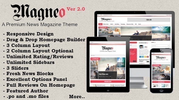
Magneo is a Responsive News Magazine and blog theme.

Important Features


  • Responsive design with option to turn off

  • Seven media query breakpoints, that occupies the maximum available screen space in any device

  • Home page builder with unlimited blocks

  • Three column layout

  • Option to change to Two column layout

  • A huge category slider for displaying recent 5 posts from all categories with options to disable it and also exclude categories

  • Breaking News

  • WordPress 3.0 menu with drop down and responsiveness

  • Integrated Breadcrumps

  • Integrated Pagination

  • Integrated related posts

  • Easily add Google analytics

  • Easily add Google adsense

  • Easily upload logo

  • Upload favicon.ico

  • Image or color body background

  • Featured author

  • Recent posts of all categories

  • Full reviews on home page – Two types

  • Header banner

  • Unlimited theme skin colors

  • Unlimited sidebars

  • Custom sidebars

  • Unlimited Review criteria and four types of rating


Home Page Builder


It comes with an easy to use advanced home page builder with unlimited blocks which are truly drag, drop and sort type. Get your website up and running within minutes

The blocks are two category and two column, single category, news in picture, video block, review-blocks, simple list, three category block,ad blocks, latest post block etc.


Rating and Reviews


The theme boasts of an excellent review and rating system with unlimited review criteria and drag and sort criteria. Review types like stars, percentage, grades, simple numbers etc. Select review box width and where to display the review.
You can also show the entire review in the homepage.

Unlimited Skin Colors


The theme also boasts of ability to have unlimited skin colors so no two website have to look the same again.

Hosting Videos


Hosting a video is now a breeze for both embed videos and self hosted videos. At present we support only mp4 self hosted videos but future updates will have support for other video formats like webm, ogg etc.

Sliders


The theme has three sliders.Elastic,Flexslider and Vertical carousel. You also have the option of not showing the slider by selecting “None”.

Unlimited sidebars


You can select between right , left and no sidebars for each and every post or page and can also include your own custom sidebars.Center sidebars remain the same through out the website.

Widgets


Custom Widgets like

  • login widget

  • facebook fans

  • flickr

  • googleplus

  • tabbed popular recent comments

  • feedburner

  • category widget


Many more to follow in next update.

Social Sharing


Apart from facebook, twitter,pinterest etc we have also included the good ol mail article and print article buttons.

Hope you like our theme.

Please rate it if you like the theme.


Images in the preview are only for demo purposes and some have been bought from photodune.net.

Credits


Thanks to

Next Update


  1. Author post block

  2. Schema data for reviews

  3. Lots of custom widgets


Future Updates


  1. Quick Html tags

  2. Separate shortcodes plugin

  3. Multi Author


Change Log


Version 2.0.1 - 16-10-13
1. Minor Bug Fixes - resolved conflict with plugins
2. Option to include category ids in category slider
3. Minor Css Fixes

Version 2.0- 06-10-13
1. .po and .mo files added for translation
2. added one category widget
3. Option to turn off responsiveness
4. Minor Bug Fixes
5. Minor Css Fixes

Version 1.0.1 - 29-09-13
1. Minor Bug Fixes
2. Option to Disable Featured Images
3. Minor Css Fixes

Initial Release Version 1.0.0 - 27-09-13

Rabu, 02 April 2014

Discover - Flat WordPress Magazine Theme (Blog / Magazine)


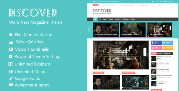
Discover is a premium WordPress theme with flat and modern design. It is created for the magazines, news and blogs sites but due to its superb flexibility, it allows you to create the websites for any other purpose. It features very clean and responsive design, which looks very good on any device.

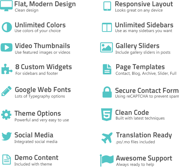
The theme is packed with a bunch of easy to configure options to make your site unique. Theme include lots of options for the typography, theme colors, homepage and many other settings. You can include the image sliders in any post or page. You can also set any video as post thumbnail simply with its embeding code.

WordPress 3.8 ready


Support:


Our customers are very important to us and we want to offer the best support possible. We have set up dedicated support forums, and will try best to answer every single question in a timely manner.


Copyright @ 2013 TopPremium Theme.

Designed by Templateify & Sponsored By Twigplay